Română
O gramatică a construcției
Ce spun, retrospectiv, exercițiile de logo din 2008 despre proces, metodă și felul de a gândi
Privite separat, aceste logo-uri par o colecție destul de obișnuită de exerciții de identitate corporativă de la sfârșitul anilor 2000: agenții, firme de real estate, companii de servicii, design, outdoor, small business. Privite împreună însă, se întâmplă ceva mult mai interesant.
După suficiente exemple, începe să apară o inteligență comună în spatele lor.
Nu doar un stil. Nu doar niște preferințe estetice. Ci o metodă.
Iar metoda este, în esență, aceasta:
iei limbajul — de obicei o literă sau un grup de litere — îl tratezi ca material plastic, îl dezmembrezi, îl reconstruiești geometric, îl comprimi într-un semn și apoi verifici dacă acel semn poate deveni obiect.
Asta este, cred, cheia întregii serii.
Și tocmai de aceea aceste lucrări sunt interesante astăzi. Nu neapărat pentru că fiecare logo ar fi, luat izolat, o soluție extraordinară, ci pentru că împreună documentează un anumit mod de a gândi designul.
I. Mai întâi trebuie să ne întoarcem în 2008
Există un risc să privim aceste lucrări cu ochii din 2026 și să proiectăm retrospectiv asupra lor ideea de „minimalism modern”.
Nu cred că ar fi corect.
În 2008, 99designs era încă o platformă foarte nouă. Fusese desprinsă din comunitatea SitePoint în februarie 2008, iar în octombrie acelui an compania vorbea deja despre peste 20.000 de designeri și despre un nou design încărcat aproximativ la fiecare 30 de secunde. Modelul era explicit competitiv: clientul publica brief-ul și bugetul, designerii trimiteau variante, iar clientul putea comenta și ghida procesul înainte de alegerea unui câștigător.
Asta contează enorm.
Pentru că nu lucrai într-un studio liniștit, unde puteai petrece trei săptămâni rafinând o singură ipoteză.
Era un mediu de producție rapidă, comparație, selecție și competiție.
Iar într-un asemenea mediu un logo trebuia să facă ceva foarte repede:
să se înțeleagă, să se distingă și să pară deja „gata de folosit”.
99designs însuși își descria atunci serviciul prin viteză, alegere și posibilitatea ca întreprinderile mici să obțină mai multe soluții într-un timp scurt.
Prin urmare, ceea ce vedem în seria ta poate fi citit și ca o adaptare foarte eficientă la economia vizuală a concursului.
Dar aici apare partea importantă:
nu te-ai adaptat devenind generic.
Ți-ai găsit o metodă proprie de a produce rapid ceva care să aibă totuși o „idee”.
II. Procesul mental pare să înceapă de la cuvânt, nu de la imagine
Asta este poate cea mai importantă descoperire.
În multe exerciții de logo design, procesul convențional ar putea fi:
„Ce simbol reprezintă domeniul?”
Real estate → casă.
Outdoor → munte.
Employment → om / carieră.
Design → creion / formă abstractă.
La tine, în schimb, punctul de plecare pare mult mai des:
„Ce pot face cu numele?”
Asta schimbă complet problema.
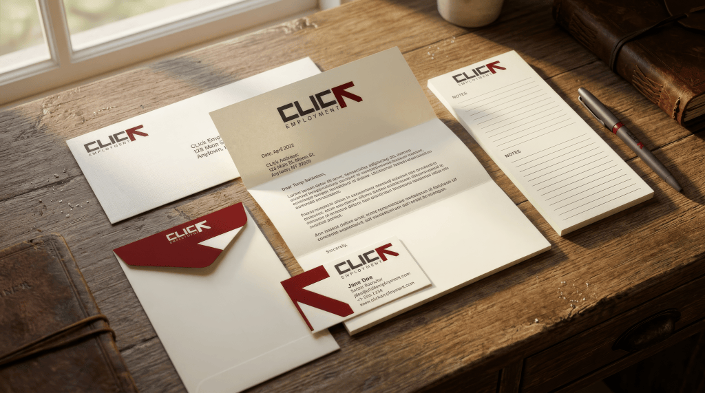
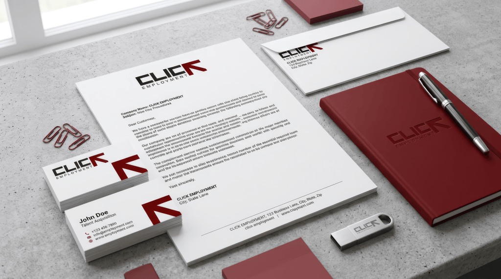
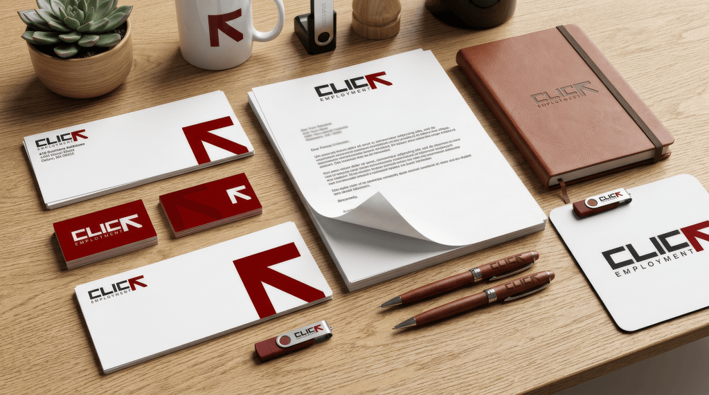
CLICK nu devine un logo pentru că ai desenat un computer sau un mouse.
Devine logo prin K.
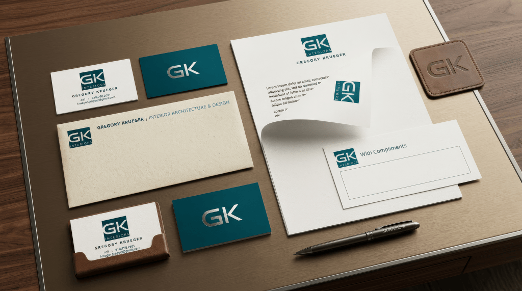
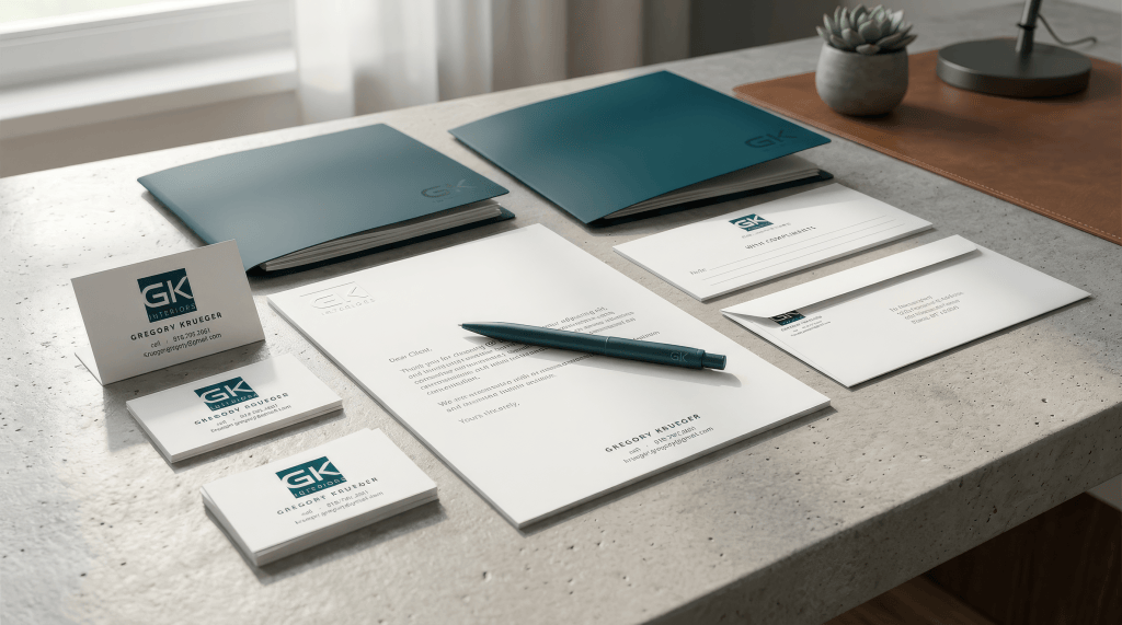
GK nu devine logo printr-un fotoliu, o clădire sau un interior.
Devine logo prin G + K.
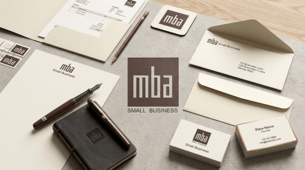
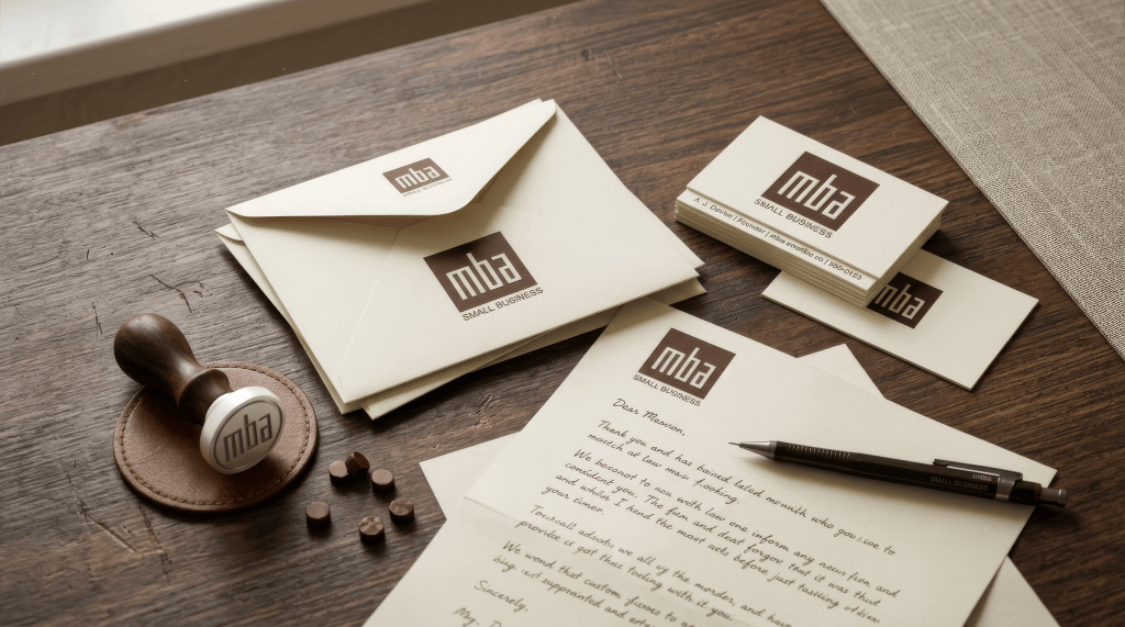
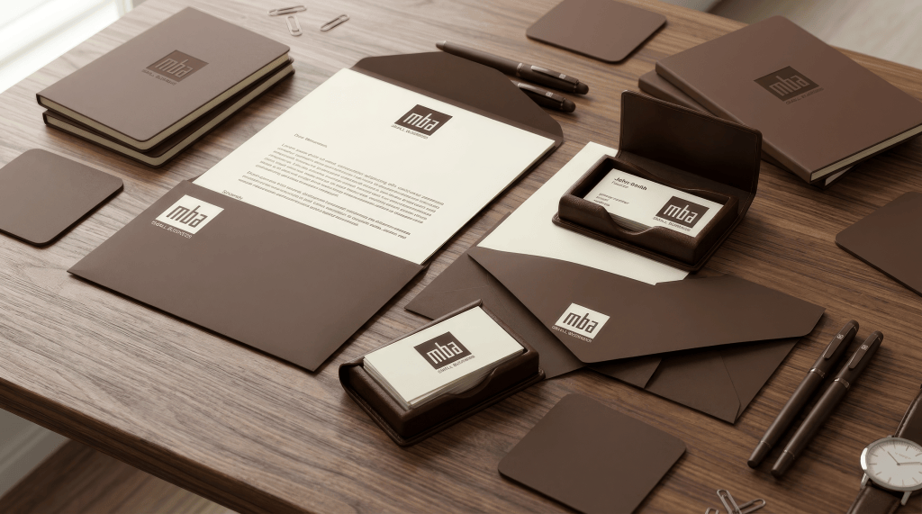
MBA nu are nevoie de un simbol exterior pentru „small business”.
Devine simbol prin m-b-a.
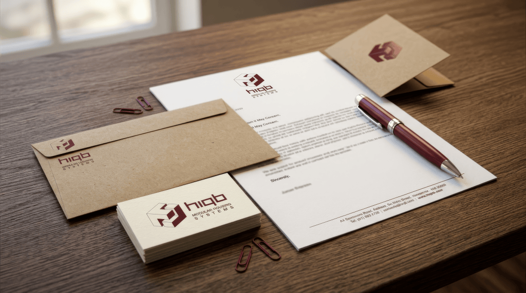
HIBO își extrage identitatea din litere și din ideea de modularitate.
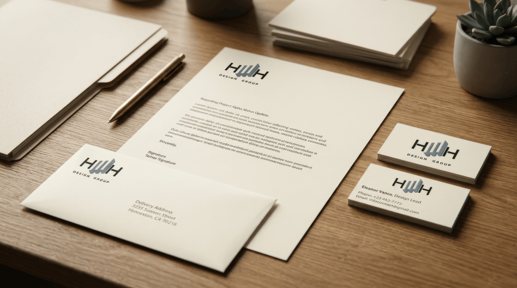
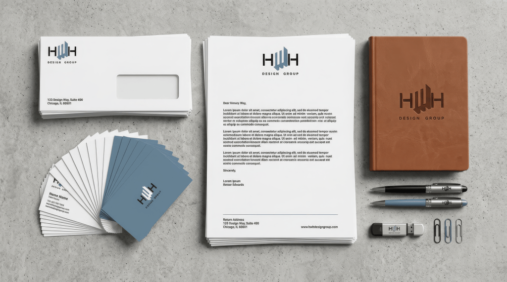
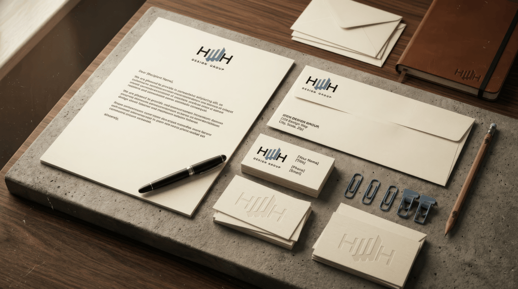
H…H / Design Group construiește chiar din inițialele numelui o structură verticală.
Așadar, primul tău impuls pare să fie:
extrage identitatea din materia verbală a brandului.
Este o strategie foarte diferită de ilustrarea domeniului.
III. Pentru tine, alfabetul nu pare să fie text. Este materie primă.
Aici cred că se află nucleul.
Există designeri care aleg un font.
Există designeri care desenează simboluri.
În aceste lucrări, tu faci frecvent altceva:
desenezi litere.
Adică iei litera ca pe o structură geometrică.
O poți:
- lărgi;
- comprima;
- decupa;
- întoarce;
- uni cu alta;
- suprapune;
- transforma în săgeată;
- transforma în container;
- transforma în arhitectură;
- transforma în pattern.
Este aproape o relație de sculptor cu alfabetul.
Și aici apare o întrebare implicită care pare să fi stat foarte des în spatele lucrului:
Cât de mult pot modifica o literă înainte să înceteze să mai fie acea literă?
Este o întrebare foarte fertilă pentru logo design.
Pentru că exact la granița aceea apare semnul.
Dacă litera rămâne complet literă, ai tipografie.
Dacă devine complet abstractă, ai simbol.
Tu lucrezi foarte des în zona dintre cele două.
IV. CLICK este exemplul cel mai transparent al acestei metode
În CLICK, K-ul este împins către o altă funcție.
El rămâne K.
Dar devine și:
săgeată.
Prin urmare, aceeași formă poate fi citită în două sisteme simultan:
alfabetic: K
iconic: direcție / click / acțiune
Asta este foarte eficient pentru că nu ai două elemente care trebuie memorate.
Ai unul singur cu două lecturi.
Și aici putem formula una dintre regulile tale implicite:
un element grafic este mai valoros dacă poate face două lucruri simultan.
O literă care este și simbol.
Un simbol care este și monogramă.
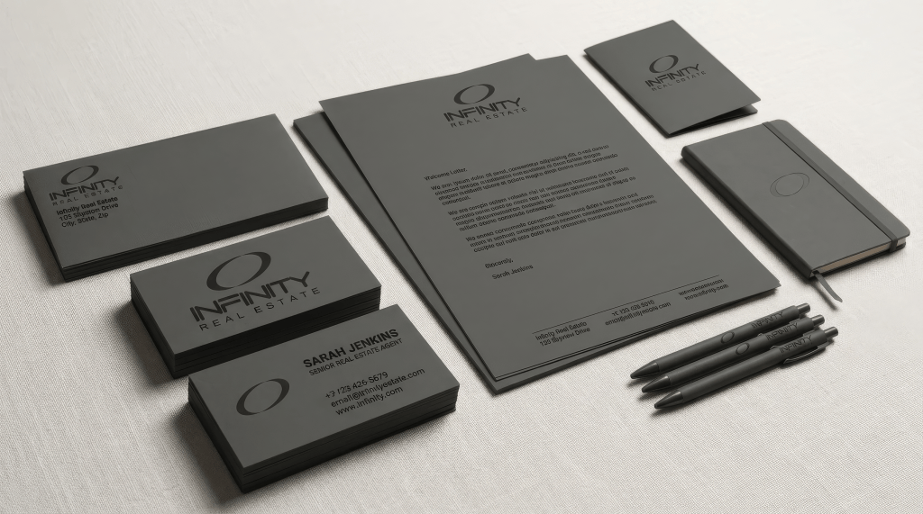
Un O care este și infinity.
Un grup de litere care este și arhitectură.
O pasăre care este și emblemă.
Această economie semantică apare iar și iar.
V. „Mai puține elemente” nu este scopul. „Mai multe funcții pe element” pare să fie scopul.
Asta este o diferență foarte importantă.
Minimalismul spune:
folosește puține lucruri.
Metoda ta pare mai degrabă:
fă fiecare lucru să lucreze cât mai mult.
Un singur K trebuie să fie K + săgeată.
Un singur O trebuie să fie O + infinity.
Un singur G/K trebuie să fie inițiale + monogramă + simbol.
Un singur set de module trebuie să fie geometrie + modularitate + emblemă.
Asta explică de ce multe dintre logo-uri au o anumită densitate conceptuală, chiar dacă formal sunt foarte simple.
VI. A doua mare obsesie: comprimarea
După ce ai extras ideea, aproape întotdeauna apare un proces de comprimare.
Un nume lung devine inițiale.
Inițialele devin monogramă.
Monograma devine pătrat.
Pătratul devine emblemă.
Emblema devine ceva ce încape pe o carte de vizită.
Este aproape un proces matematic:
nume → abreviere → structură → simbol → unitate
Și rezultatul final este aproape întotdeauna foarte compact.
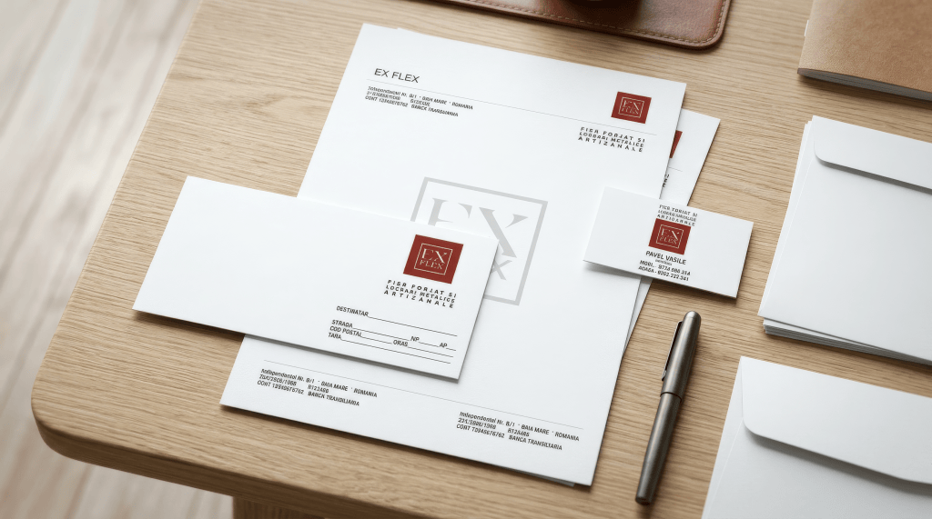
Aici EX FLEX, MBA, GK și HIBO sunt foarte revelatoare.
Ai o atracție evidentă pentru semnul dens.
Nu vrei ca identitatea să se răspândească.
Vrei să se concentreze.
VII. De aici vine obsesia pentru containere
Pătratul, dreptunghiul, banda, cadrul nu sunt doar forme decorative.
Ele rezolvă o problemă.
Un semn abstract este uneori instabil.
Un container îl stabilizează.
Îi spune ochiului:
„acesta este un obiect.”
Și imediat ce ai obținut obiectul, îl poți muta oriunde.
Pe:
- carte de vizită;
- plic;
- hârtie;
- agendă;
- pix;
- ștampilă;
- copertă;
- USB;
- ambalaj;
- firmă.
Asta explică de ce identitățile tale par atât de naturale în mock-up-uri.
Nu pentru că mock-up-ul le face mai bune.
Ci pentru că structura lor era deja compatibilă cu obiectul.
VIII. Și aici cred că apare adevăratul tău „mindframe”: nu proiectezi logo-uri, proiectezi mici artefacte
Acesta mi se pare lucrul cel mai profund din serie.
Când văd aceste lucrări, nu am impresia că întrebarea fundamentală era:
„Cum va arăta logo-ul?”
Ci mai degrabă:
„Ce fel de lucru este acest logo?”
Este o diferență subtilă, dar enormă.
Un logo poate fi:
- desen;
- icon;
- text;
- emblemă;
- ștampilă;
- sigiliu;
- monogramă;
- obiect industrial;
- marcă imprimată.
Tu pari atras în mod special de ultimele patru.
Adică logo-ul trebuie să aibă obiectualitate.
Trebuie să poată exista în afara monitorului.
IX. De aceea embosarea, gravura și monocromia apar atât de natural
Un logo construit din geometrie și contrast puternic poate supraviețui fără culoare.
Și seria testează implicit exact asta.
MBA poate fi ștanțat.
GK poate fi gravat.
HIBO poate deveni o ștampilă.
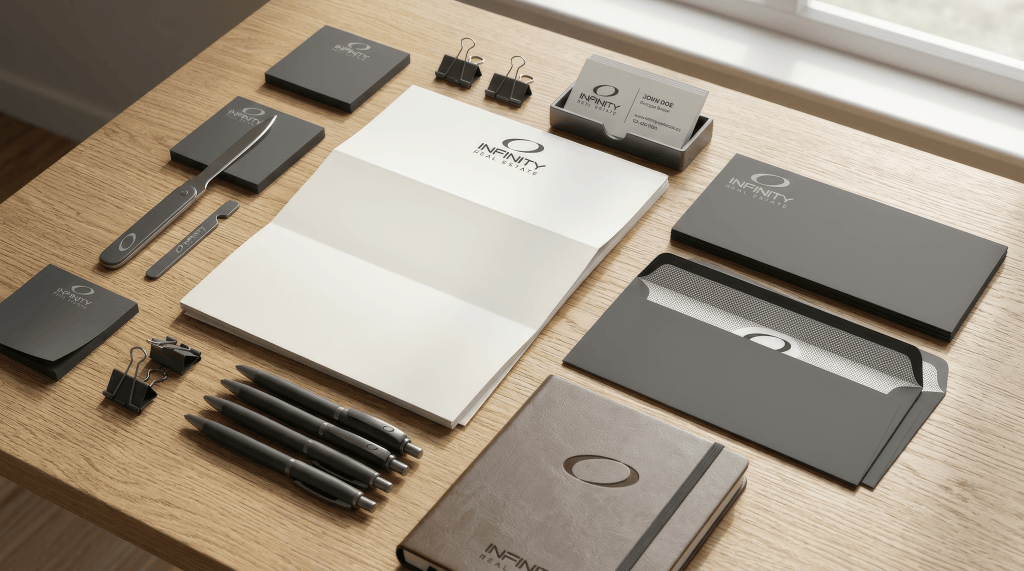
INFINITY poate fi debosat.
CLICK poate fi reliefat.
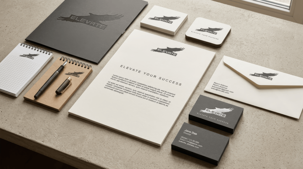
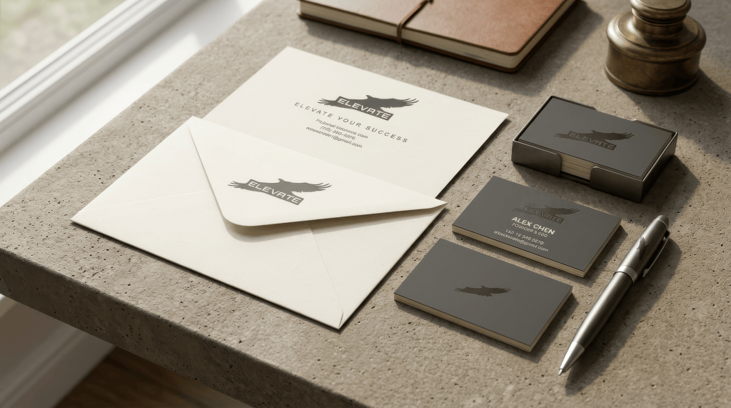
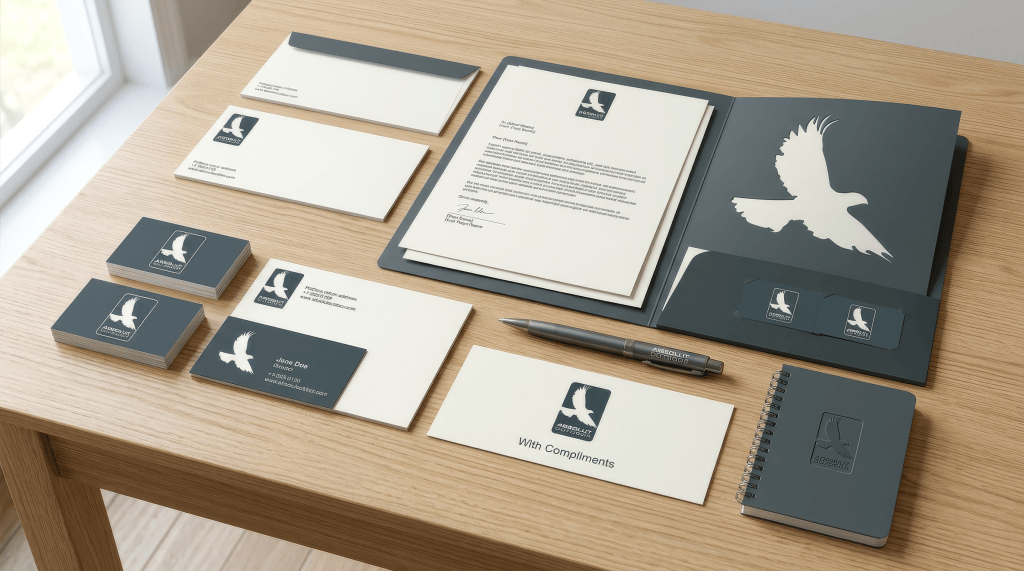
ELEVATE poate fi imprimat în negativ.
Aceasta nu este o simplă preferință estetică.
Este un fel de test de robustețe.
Dacă semnul funcționează:
- negru pe alb;
- alb pe negru;
- relief;
- gravură;
- dimensiune mică;
atunci ai o identitate care nu depinde de efect.
X. Și tocmai aici se vede o formă de gândire „industrială”
Nu în sensul că logo-urile sunt industriale.
Ci în sensul că te interesează fabricabilitatea.
Un designer poate gândi:
„Arată bine.”
Tu pari să fi întrebat mai des:
„Poate fi făcut?”
Poate fi:
ștanțat?
tăiat?
embosat?
reprodus mic?
pus pe un obiect?
folosit singur?
Asta este o mentalitate foarte diferită de ilustrație.
Este aproape design de produs aplicat identității.
XI. Există și o economie extraordinară de culoare
În majoritatea exemplelor apar palete foarte restrânse:
- negru/alb;
- gri;
- roșu + negru;
- maro + crem;
- teal + alb;
- gri-albăstrui.
Nu există dorința de a „colora” logo-ul.
Culoarea este aproape întotdeauna instrument, nu subiect.
Roșul din CLICK semnalizează acțiunea.
Teal-ul din GK oferă o temperatură mai sofisticată.
Maro-ul din MBA îl împinge spre materialitate și seriozitate.
Griul din Infinity îl face corporativ.
Albastrul din Design Group îl face mai arhitectural/tehnic.
Dar dacă scoți culoarea, sistemul rămâne.
Asta este un semn că forma este prioritară.
XII. Există însă și un paradox: îți plac obiectele complexe, dar logo-urile simple
Mock-up-urile sunt bogate.
Piele, hârtie, lemn, metal, pixuri, cărți, ștampile.
Logo-urile, dimpotrivă, sunt austere.
Această contradicție este interesantă.
Cred că aici apare o concepție implicită despre design:
cu cât obiectul este mai bogat, cu atât marca trebuie să fie mai simplă.
Logo-ul nu concurează cu lumea.
O ordonează.
Și de aceea multe dintre identități capătă o calitate aproape de sigiliu.
XIII. MBA este poate cazul în care această metodă se vede cel mai limpede
„mba” este un material verbal foarte modest.
Nu există nimic memorabil în abrevierea în sine.
Dar tocmai asta pare să te provoace.
În loc să cauți o metaforă pentru „small business”, iei cele trei litere și spui, implicit:
„Pot să fac din acestea un obiect suficient de distinct încât să nu mai am nevoie de metaforă.”
Asta este foarte caracteristic pentru gândirea de monogramă.
Și are o calitate aproape heraldică:
inițiale → stemă.
De aceea MBA funcționează atât de bine pe:
- ștampilă;
- plic;
- card;
- copertă;
- piele.
Devine aproape un blazon corporativ.
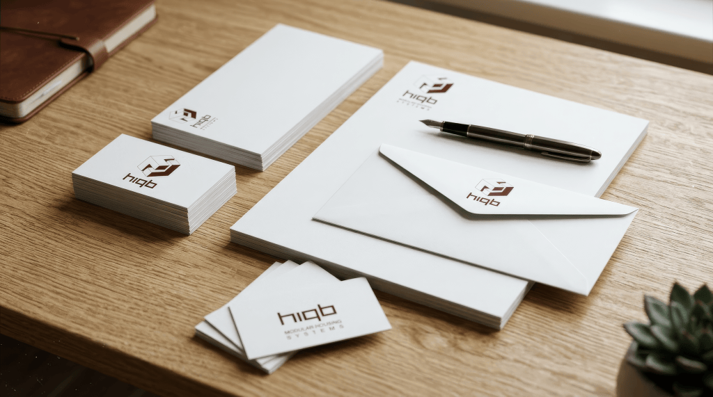
XIV. HIBO duce aceeași idee într-o zonă aproape arhitecturală
Aici nu mai ai doar litere.
Ai module.
Și asta este una dintre cele mai interesante treceri din serie:
litera devine modul.
Odată ce litera devine modul, ea poate fi:
- repetată;
- oglindită;
- rotită;
- combinată;
- închisă;
- deschisă.
Adică alfabetul devine sistem.
Și asta explică perfect de ce „Modular Systems” pare aproape mai mult decât un descriptor.
Logo-ul însuși se comportă modular.
Aici există o potrivire rară între concept și metodă.
XV. GK este o altă formă de reducție
GK este interesant tocmai pentru că nu ai încercat să inventezi un simbol nou.
Ai spus, practic:
„G și K sunt suficiente.”
Dar ai refuzat să le lași ca două litere independente.
Le-ai comprimat într-un singur organism.
Asta spune ceva despre filozofia seriei:
identitatea nu trebuie neapărat adăugată numelui. Poate fi extrasă din el.
Este o idee foarte puternică.
Și foarte economică.
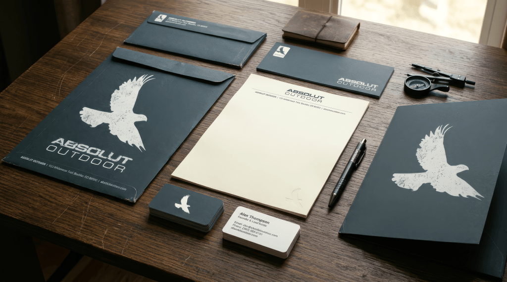
XVI. ELEVATE și pasărea introduc singura ruptură majoră
Acolo apare o imagine figurativă.
Și este important că tocmai acolo rezultatul devine mai convențional.
Pasărea pentru „elevate” / „outdoor” este o metaforă directă.
Funcționează.
Este memorabilă.
Dar nu are aceeași tensiune intelectuală ca:
K → săgeată
sau
GK → monogramă
sau
MBA → emblemă
Asta îmi sugerează ceva despre tine ca designer:
atunci când plecai de la imagine, deveneai mai convențional; când plecai de la tipografie, deveneai mai personal.
Este poate cea mai importantă observație critică pe care aș face-o.
XVII. Asta sugerează și unde era adevărata ta zonă de forță
Nu în ilustrație.
Nu în storytelling vizual amplu.
Nu în ornament.
Ci în:
transformarea unei structuri verbale într-o structură vizuală.
Acolo seria devine foarte coerentă.
Și această abilitate este mai profundă decât „știi să faci logo-uri”.
Este o formă de gândire translațională:
limbaj → formă
formă → simbol
simbol → obiect.
XVIII. Cum probabil se desfășura procesul, chiar dacă nu mai avem schițele
Evident, nu putem ști exact ce făceai în 2008. Dar seria permite reconstruirea plauzibilă a unei metode.
Probabil exista ceva de genul:
1. Citeai numele.
Nu cred că primul lucru pe care îl făceai era să cauți imagini.
Mai întâi identificai:
- literele interesante;
- inițialele;
- repetițiile;
- cuvintele cu potențial semantic.
2. Izolai o anomalie.
De exemplu:
K-ul din CLICK.
O-ul din INFINITY.
G/K.
MBA.
structura lui HIBO.
3. O geometrizai.
Transformai alfabetul în:
- bare;
- unghiuri;
- dreptunghiuri;
- cercuri;
- spații negative.
4. Căutai o a doua lectură.
Aici este esențial.
Nu era suficient:
„arată bine.”
Trebuia să poată spune și:
„mai este ceva aici.”
K → săgeată.
O → infinity.
inițiale → clădire.
module → sistem.
5. Îl compactai.
Apoi venea pătratul, cadrul, banda, monograma.
6. Îl testai în aplicații.
Și abia aici începea identitatea.
XIX. În acest sens, 99designs poate să fi funcționat pentru tine ca un laborator
Asta mi se pare foarte important.
Nu trebuie să presupunem că fiecare exercițiu era o încercare serioasă de carieră în branding.
Poate că platforma îți oferea ceva mai interesant:
o succesiune de probleme mici de rezolvat.
Un nume.
Un domeniu.
Un brief.
O constrângere.
Și tu puteai testa:
„Ce pot scoate din acest cuvânt?”
Asta face seria să semene mai mult cu un caiet de studii decât cu un portofoliu omogen.
Iar concursurile de pe platformă chiar erau construite în jurul acestei dinamici: multe propuneri, feedback, selecție și timp relativ scurt.
În 2008, 99designs se afla chiar în perioada în care acest model de competiție devenea una dintre principalele sale caracteristici; compania raporta în septembrie peste 90.000 USD în premii deschise și aproximativ 13.000 USD de premii noi oferite zilnic.
Prin urmare, exercițiul putea avea o valoare în sine:
brief → soluție → feedback → următorul brief.
Un fel de sală de sport pentru gândirea vizuală.
XX. Și aici apare o posibilă explicație pentru varietatea aparentă
Dacă le-ai făcut pentru concursuri, nu trebuia să construiești aceeași identitate de fiecare dată.
Trebuia să găsești o idee rapidă pentru fiecare problemă.
Dar, chiar schimbând domeniul, instrumentele tale rămân aceleași.
Este exact ce vedem.
Subiectele se schimbă:
employment
real estate
small business
interiors
outdoor
design group
modular systems
dar operația rămâne:
reducere → geometrizare → integrare → emblemă.
Asta este coerenta reală a seriei.
XXI. Și mai există o idee de subtext: controlul
Poate chiar cea mai subtilă.
Toate aceste logo-uri sunt foarte controlate.
Nu există aproape nimic accidental.
Marginile sunt clare.
Formele sunt închise.
Spațiile sunt calculate.
Simbolurile sunt compacte.
Culoarea este limitată.
Tipografia este disciplinată.
Chiar și atunci când folosești o pasăre, ea este redusă la o siluetă.
Aș spune că există o preferință foarte puternică pentru:
ordine obținută prin reducere.
Nu este o estetică exuberantă.
Este una de domesticire a complexității.
Iei ceva complex — un cuvânt, un domeniu, o identitate — și îl transformi într-o formă pe care ochiul o poate ține într-o singură privire.
XXII. Dar această nevoie de control produce și limitele seriei
Aici merită să fim critici.
Aceeași metodă care produce coerență poate produce și repetiție.
Dacă fiecare problemă devine:
literă → geometrie → emblemă,
la un moment dat începi să vezi mecanismul înainte să vezi brandul.
În unele exemple, logo-ul pare să spună:
„Uite ce deștept am transformat litera.”
înainte de a spune:
„Uite cine este compania.”
Este diferența dintre ingeniozitate formală și identitate profundă.
Unele dintre lucrări trec foarte bine această probă.
Altele rămân mai mult demonstrații de dexteritate.
Și cred că asta este normal pentru un laborator de exerciții.
XXIII. Există și o tensiune între „corporate” și „personal”
Ai ales un limbaj foarte corporativ:
- sans serif;
- geometrie;
- monocrom;
- roșu/negru;
- albastru/gri;
- monogramă;
- mult spațiu alb.
Asta era perfect compatibil cu piața de logo-uri a perioadei.
Dar în interiorul acestui limbaj apar mici gesturi foarte personale:
K-ul-săgeată.
MBA construit ca lettering.
GK comprimat.
HIBO modularizat.
H/H transformat în arhitectură.
Acolo începe să apară autorul.
Nu în paletă.
Nu în font.
Ci în operația de transformare.
XXIV. Dacă aș încerca să definesc „algoritmul” tău de atunci
Ar suna aproximativ așa:
1. Ia numele.
2. Găsește litera cea mai interesantă.
3. Găsește o formă geometrică latentă în ea.
4. Amplifică forma.
5. Fă forma să însemne încă ceva.
6. Elimină tot ce nu este necesar.
7. Pune rezultatul într-o unitate compactă.
8. Verifică dacă funcționează monocrom.
9. Verifică dacă poate fi imprimat pe ceva.
10. Pune numele lângă el și vezi dacă cele două se susțin reciproc.
Dacă această reconstrucție este corectă, atunci ai avut deja în 2008 un proces de design surprinzător de bine definit.
Poate nu formulat teoretic.
Dar practic.
XXV. Iar ultimul pas este foarte interesant: obiectualizarea
Aici cred că mock-up-urile contemporane ne ajută enorm.
Când văd aceste identități pe:
- plicuri;
- cărți;
- agende;
- ștampile;
- pixuri;
- coperți;
- USB-uri;
îmi dau seama că fiecare logo a fost, implicit, conceput ca marcă în sensul vechi al cuvântului.
O marcă este ceva pe care îl pui pe un lucru.
Nu doar ceva pe care îl afișezi într-un header.
Și poate că aceasta este cea mai frumoasă contradicție a exercițiilor:
sunt produse pentru internet, într-o platformă foarte nouă și foarte digitală, dar gândesc identitatea într-un mod aproape analogic.
Într-un marketplace online, tu proiectezi:
ștampile, monograme, semne, obiecte.
Asta este foarte interesant.
XXVI. În fond, nu minimalismul este firul roșu
Dacă ar trebui să elimin toate interpretările secundare și să păstrez o singură idee din serie, nu aș spune:
„Îți plăcea minimalismul.”
Este prea superficial.
Aș spune:
Îți plăcea să descoperi cât de mult sens poate fi înghesuit într-o formă foarte mică.
Asta explică mult mai bine totul.
De aceea:
K-ul poate deveni săgeată.
O-ul poate deveni infinit.
inițialele pot deveni clădire.
literele pot deveni modul.
trei litere pot deveni emblemă.
o pasăre poate deveni sigiliu.
Nu cauți neapărat simplitatea.
Cauți densitatea.
XXVII. Și există o dimensiune aproape filosofică a acestei metode
Un logo bun, în această concepție, este o formă care spune:
„Nu am nevoie de multe lucruri ca să fiu recunoscut.”
Dar există ceva mai profund:
„Tot ce am nevoie este deja aici.”
Numele conține literele.
Literele conțin geometria.
Geometria conține simbolul.
Simbolul conține identitatea.
Asta este o filosofie a extragerii, nu a adăugării.
Nu iei o companie și îi atașezi o imagine.
Scoți imaginea din companie.
Și, retrospectiv, asta mi se pare poate cea mai coerentă idee din tot materialul.
XXVIII. Ce spune seria despre designerul de atunci
Cu toate precauțiile necesare — pentru că vedem doar rezultatele, nu și schițele sau procesul real — eu aș descrie designerul care emerge de aici astfel:
un designer foarte orientat spre structură;
foarte sensibil la forma literelor;
interesat de economie formală;
atras de monograme și embleme;
interesat de ambiguitatea dintre literă și imagine;
mai puternic în transformarea tipografiei decât în ilustrație;
interesat de reproducibilitate;
și foarte preocupat ca un semn să poată deveni obiect.
Și, poate cel mai important:
nu pare să gândească în primul rând „ce să desenez?”, ci „ce operație pot face asupra acestui material?”
Asta este o diferență de mentalitate.
XXIX. Dacă ar fi să rezum metoda într-o singură formulă
Aș scrie-o așa:
WORD → LETTER → GEOMETRY → AMBIGUITY → SYMBOL → OBJECT
și, uneori:
IMAGE → ABSTRACTION → SYMBOL → OBJECT
Prima este evident dominantă.
Iar întreaga serie pare să fie o explorare a primei formule.
XXX. De aceea aceste exerciții sunt mai valoroase retrospectiv decât par
Dacă mi-ai fi arătat un singur logo, aș fi putut spune:
„OK, un logo geometric bun, specific perioadei.”
Două sau trei: aceeași impresie.
Dar după această cantitate de material, apare altceva.
Apare autorul.
Nu autorul ca „stil grafic”, ci autorul ca procedeu de gândire.
Și asta este mult mai interesant.
Pentru că stilul se poate schimba.
Fonturile se schimbă.
Paletele se schimbă.
Moda se schimbă.
Tehnologia se schimbă.
Dar o operație mentală poate rămâne aceeași ani întregi.
Iar aici operația pare să fie:
ia ceva deja existent — o literă, un cuvânt, o formă — și vezi dacă poți descoperi în interiorul lui o a doua identitate.
K nu mai este doar K.
O nu mai este doar O.
GK nu mai sunt doar două litere.
MBA nu mai este doar o abreviere.
O pasăre nu mai este doar o pasăre.
Un grup de bare nu mai este doar geometrie.
Fiecare trebuie să devină altceva fără să înceteze complet să fie ceea ce a fost.
Acolo, cred, se află adevărata coerență a seriei.
Și dacă ar trebui să-i dau un titlu retrospectiv nu i-aș spune Logo Designs, 2008.
I-aș spune:
The Second Meaning
Studies in turning language into objects
Pentru că asta pare să fi fost, în esență, exercițiul: nu să inventezi semne din nimic, ci să descoperi al doilea sens ascuns în lucrurile pe care le aveai deja în față.
English version
The Second Meaning — Studies in Turning Language into Objects
Looking at these logos today, the interesting thing is not simply that they are designs made in 2008, nor even that some of them are more successful than others as individual identities. What is much more revealing is the coherence of the thinking behind them.
Taken together, they do not look like a random collection of logo proposals. They reveal a fairly consistent visual method — a particular way of looking at words, letters, symbols and meaning.
And I think that method is actually more interesting than any individual logo.
The central operation seems to be something like:
WORD → LETTER → GEOMETRY → AMBIGUITY → SYMBOL → OBJECT
There is also a secondary route, used in the more figurative marks:
IMAGE → ABSTRACTION → SYMBOL → OBJECT
In both cases, the final objective is similar: to reduce something potentially complicated to a small, compact visual unit capable of carrying several layers of meaning simultaneously.
1. The starting point was usually the word
One of the clearest characteristics of the series is that the logos generally seem to originate inside the name itself.
Rather than starting with the question:
“What symbol represents employment / real estate / interiors / outdoor activities / modular systems?”
the process seems much closer to:
“What is visually interesting about this particular name?”
That distinction is fundamental.
A conventional approach to logo design often starts from the client’s industry and searches for a recognizable metaphor: a house for real estate, a roof for construction, a bird for freedom, a light bulb for ideas, and so on.
Here, something else is happening.
The language itself becomes the raw material.
A letter can be isolated, enlarged, compressed, rotated, divided, mirrored, connected to another letter, or made to perform another semantic function.
The alphabet is no longer merely something that carries language.
It becomes visual matter.
And that seems to be one of the strongest signatures of the entire group.
2. The letter is not a letter anymore
The most revealing example is probably CLICK Employment.
The red K is not simply a K printed in a different color. It has been transformed into a directional arrow.
So one form performs several operations simultaneously:
K + arrow + movement + click/action
This is exactly the kind of compression that appears repeatedly throughout the series.
Instead of adding a separate symbol to the name, the symbol is extracted from the name.
That is a significant conceptual difference.
The logo does not say:
CLICK + [arrow]
It effectively says:
CLICK contains an arrow.
The semantic object was already hidden inside the word; the design process merely had to uncover it.
This seems to be one of the central pleasures behind these exercises: finding a second meaning inside an existing verbal structure.
3. You seem to have been interested in “double-duty” forms
Again and again, one visual element is asked to do more than one job.
The best solutions are therefore not simply recognizable. They are economical.
A single shape can simultaneously be:
- a letter,
- an initial,
- a geometric construction,
- an abbreviation,
- a symbol,
- a metaphor,
- and a brand identifier.
This is visible in different ways throughout the series.
In CLICK, the K becomes an arrow.
In INFINITY, the O/oval becomes something between a letter, a zero and an infinity symbol.
In GK Interiors, the initials become a monogram and then an independent emblem.
In HIBO, geometric components suggest both letters and modular construction.
In the H/H Design Group concept, the alphabet becomes architecture.
This is not merely minimalism.
It is semantic compression.
You seem to have been asking:
How much information can I make one shape carry?
That question is probably more revealing than any stylistic description such as “geometric,” “minimal,” or “corporate.”
4. The recurring operation: compression
There is a very strong process of reduction running through the work.
Something begins as:
name → letters → initials → visual relationship → geometry → compact sign
The further the process goes, the less the original material resembles ordinary typography.
This is especially evident in MBA / Small Business.
The “mba” lettering becomes almost architectural. The letters cease to behave primarily as alphabetic characters and begin behaving as pieces of a geometric construction.
Eventually, the word can function as a compact emblem.
This is a fascinating transformation because it reverses the usual relationship between typography and logo design.
Normally:
symbol + typography = identity
Here, very often:
typography → symbol
The lettering itself becomes the icon.
5. The square keeps appearing for a reason
Another important coherence becomes visible when the logos are viewed together: the attraction to containers.
Squares, rectangles, framed marks, compact monograms and enclosed geometric structures appear repeatedly.
I don’t think this should be interpreted merely as a stylistic preference for squares.
The container performs an important conceptual function.
It stabilizes abstraction.
A highly geometric monogram can otherwise feel unstable or arbitrary. Put it inside a square and suddenly it becomes:
- a badge,
- a stamp,
- an emblem,
- an institutional sign,
- a physical object,
- something that can be reproduced.
This is especially important when looking at the modern mockups.
The logos don’t merely look like graphics.
They look like things that could become objects.
They could be:
- stamped,
- embossed,
- engraved,
- printed on stationery,
- placed on packaging,
- applied to a pen,
- reproduced on a small surface,
- used as a seal.
That physical potential is a significant part of the visual logic.
6. The logos seem to have been designed as artifacts, not just images
This becomes particularly obvious when looking at the stationery mockups.
Obviously, these contemporary mockups are not evidence of how the original 2008 presentations looked. They are reconstructions/presentations of the old concepts.
But precisely because the same marks are shown on physical surfaces, something interesting becomes visible retrospectively.
A large proportion of the identities survive being turned into objects.
They don’t depend entirely on color, gradients or elaborate rendering.
They can become black ink.
They can become a relief.
They can become an embossing.
They can become a stamp.
They can become a tiny mark.
That suggests a fairly strong underlying instinct:
A logo should not only look good on the screen. It should behave like a physical sign.
This also explains the attraction to closed, compact geometric forms.
They are naturally suited to reproduction.
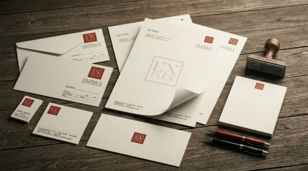
7. EX FLEX: the emblem as a system
The EX FLEX concept is another good example of this thinking.
The geometric mark is constructed almost like a small machine.
The letters are abstracted and reorganized into a contained form, while the accompanying wordmark provides the linguistic clarification.
The important relationship is therefore:
symbol = compressed information
wordmark = expanded information
The emblem does not have to explain itself completely.
It can remain somewhat mysterious.
That ambiguity is actually useful.
The viewer sees a geometric object first, and only afterward can begin to reconstruct the letters or meanings inside it.
This creates a small cognitive reward:
“Oh — that’s what I’m looking at.”
That moment of recognition seems to be something the work repeatedly seeks.
8. INFINITY: the pleasure of ambiguity
The INFINITY Real Estate mark operates differently but according to the same basic principle.
The oval/O-like form can be read as a letter, a zero, a loop, or something approaching an infinity symbol.
The important thing is not that it literally reproduces the mathematical infinity sign.
The interesting part is the zone of overlap between different readings.
This is characteristic of the strongest ideas in the series.
You seem less interested in an image that says exactly one thing than in a form that allows the viewer to discover:
“It is this — but it is also something else.”
That second reading is where the conceptual energy lives.
9. ELEVATE and the more figurative side
The ELEVATE identity takes a different route.
Here the metaphor is much more explicit: bird, wings, upward movement, elevation.
It is immediately understandable.
The advantage is communicative clarity.
The disadvantage, compared with the letter-derived marks, is that the metaphor is more conventional.
The bird/wings association with “elevate,” “success,” aspiration and upward movement is a familiar visual language.
This difference is revealing.
When you start from a word, the possibilities seem to become more personal and structurally interesting.
When you start from a metaphor, the solution becomes more dependent on an established visual vocabulary.
That distinction runs through the whole series.
The letter-based concepts feel like discoveries.
The figurative concepts feel more like interpretations.
10. HIBO: where the method becomes almost explicit
HIBO Modular Systems may be one of the clearest demonstrations of the underlying design logic.
The geometric symbol has a modular character almost before the word “Modular Systems” is even read.
The components appear constructed, assembled and repeatable.
Here, the visual language of the logo and the semantic language of the company reinforce each other.
But something else happens too.
The letters themselves become modules.
This is an important evolution of the basic method.
At first, the letter is transformed into geometry.
Here, geometry becomes a system, and the system becomes an interpretation of the company’s activity.
So the conceptual chain becomes:
letter → geometry → module → system
This is more sophisticated than simply illustrating “modular systems” with a generic construction icon.
11. GK Interiors: identity without illustration
The GK Interiors mark is interesting for another reason.
It doesn’t need a sofa, a chair, a room, a lamp or a house.
Instead, it takes the initials G + K and turns them into a compact monogram.
This is a more mature identity strategy.
The company does not need to explain its industry through an illustration.
The name itself becomes the visual asset.
“INTERIORS” then functions as clarification rather than as the source of the symbol.
Again, the hierarchy is:
identity → symbol
rather than:
industry → illustration
That difference appears repeatedly in the series.
12. H/H Design Group: turning typography into architecture
The H/H concept pushes the same mechanism toward architecture.
The two H-like structures are organized symmetrically around a central vertical element.
The result can be read simultaneously as:
- letters,
- initials,
- a building,
- an architectural volume,
- a façade,
- a central axis,
- a sense of verticality or growth.
This is another example of the same basic pleasure:
one shape, several readings.
The alphabet is being treated almost sculpturally.
You are not merely choosing letters.
You are building with them.
13. There is a strong preference for extraction rather than addition
If I had to identify one conceptual distinction separating this body of work from a more conventional logo-design approach, it would be this:
You tend to extract rather than add.
A conventional process might be:
company → industry → metaphor → symbol → logo
Your process appears more often to be:
company name → interesting letter/relationship → abstraction → symbol → logo
That produces a very different kind of identity.
The symbol feels as though it belongs to the name, rather than having been attached to it from outside.
That is why the strongest marks in the group feel relatively inevitable once you see the solution.
The K really can be an arrow.
The initials really can become the monogram.
The letters really can become architecture.
The modular geometry really can belong to a modular-systems company.
The solution feels discovered rather than invented.
14. The underlying mindframe: visual problem solving
I would be careful about turning a collection of old design exercises into a psychological portrait. We cannot know exactly what you were thinking while making them.
But we can infer something about the problem-solving behavior visible in the artifacts.
The repeated operations suggest a mindframe interested in:
- structure,
- compression,
- transformation,
- ambiguity,
- economy,
- hidden relationships,
- systems,
- and secondary meanings.
In other words, the pleasure seems not to come primarily from decorating something.
It comes from figuring something out.
The logo is almost a small intellectual puzzle.
There is a problem:
How can this name become a sign?
Then another:
Can the sign contain another meaning?
Then another:
Can the form be reduced further?
And finally:
Can it survive as an object?
That sequence is visible across the work.
15. The 99designs environment matters
The fact that these were made as exercises on 99designs in 2008 is also important.
99designs was founded in 2008 and emerged from an online forum in which designers competed through design contests. By October 2008, the company described its marketplace as having more than 20,000 designers, with a new design uploaded approximately every 30 seconds. The model involved clients posting requirements and budgets, designers submitting concepts, and clients commenting and selecting a winner, generally within roughly a week.
That context changes the interpretation of the series.
This was not necessarily a long, slow identity-development environment.
It was potentially a laboratory for rapid visual problem solving.
One brief.
One name.
One problem.
Find an idea.
Reduce it.
Submit it.
Move on to the next one.
Seen in that context, these logos begin to look like exercises in visual cognition.
The platform may have functioned almost like a gym.
Not necessarily a place where every individual logo had to become a definitive identity, but a place where you could repeatedly train the ability to take a verbal problem and produce a visual solution quickly.
And that may explain why the series contains both very strong ideas and more conventional ones.
The value of the exercise wasn’t necessarily that every answer was perfect.
The value was the repetition.
16. The recurring method I would reconstruct
Obviously, we don’t have your original sketches, intermediate versions, rejected ideas, or the actual sequence in which these logos were created.
So this is an interpretation based on the surviving results, not a factual reconstruction.
But if I had to reconstruct the method, I would imagine something approximately like this:
1. Read the name
Not the industry first — the name.
2. Search for visual anomalies
Which letter is interesting?
Which two letters interact?
Is there an unusual abbreviation?
Is there a semantic contradiction?
Is there a letter that can become something else?
3. Isolate the interesting component
One letter or relationship becomes the nucleus of the concept.
4. Geometrize it
Remove typographic complexity.
Reduce it to lines, angles, circles, blocks, symmetry and negative space.
5. Search for a second reading
Can the resulting form also be:
- an arrow?
- infinity?
- architecture?
- a module?
- a bird?
- a directional sign?
- an emblem?
6. Compress it
Keep removing until the idea can exist in a compact form.
7. Test it in monochrome
If the idea disappears without color, the structure may not be strong enough.
8. Test it as an object
Can it be stamped?
Embossed?
Engraved?
Printed small?
9. Reintroduce typography
Only after the symbol has acquired its structure.
10. Add the descriptor
“Employment,” “Real Estate,” “Interiors,” “Modular Systems,” etc., provide semantic clarification.
This is, of course, my reconstruction — not something we can establish historically without the original working files.
But the repeated visual evidence makes the reconstruction plausible.
17. There is also a kind of discipline in the work
Another layer appears when the logos are considered collectively.
There is a noticeable attraction to control.
Closed forms.
Limited colors.
Geometric structures.
Strong symmetry.
Compact proportions.
Hard edges.
Restricted visual vocabularies.
The compositions don’t tend toward visual excess.
Even when the underlying idea is complex, the final object tends to be restrained.
This creates an interesting paradox:
The thinking is complicated; the object is simple.
That may actually be one of the central aesthetic principles of the work.
Complexity is allowed to exist in the conceptual mechanism, but not necessarily in the final appearance.
The viewer sees a small sign.
The complexity is hidden inside it.
18. This is why ambiguity matters so much
A purely descriptive logo gives the viewer the answer immediately.
A successful compressed mark often gives the viewer a question first.
What is this?
Is that a K?
Is that an arrow?
Is that an H?
Is that a building?
Is that a G and a K?
Is that an O?
Is that infinity?
The viewer reconstructs the solution.
That reconstruction creates engagement.
And this is perhaps the deepest commonality among the strongest pieces in the group:
They contain a small discovery.
The logo doesn’t merely communicate.
It makes the viewer notice something.
19. But the method has a danger: mannerism
The same coherence that makes the series interesting also reveals its limitation.
A method can become a formula.
Once you discover that letters can become geometric symbols, it becomes tempting to solve everything that way.
Then the viewer starts recognizing the designer’s method before recognizing the client’s identity.
That is a real risk in this body of work.
Some marks are so interested in the transformation of the letters that the cleverness of the transformation threatens to become the main message.
In other words:
“Look what I did with the letters”
can sometimes become louder than:
“This is the identity of the company.”
That is particularly relevant retrospectively.
The strongest concepts are those in which the transformation is not merely clever but necessary.
20. The figurative concepts reveal the boundary of the method
The bird in ELEVATE, for example, works perfectly well as communication.
But because the metaphor is already culturally established, there is less discovery.
This gives us an interesting diagnostic.
When the work begins with the internal structure of the name, you tend to get more unusual results.
When it begins with an external metaphor, the results become more conventional.
That suggests that your real strength at the time may not have been illustration in the traditional sense.
It may have been something more specific:
the translation of verbal structure into visual structure.
That is a much more precise description.
You were not necessarily trying to draw what a company does.
You were trying to discover what the name could become.
21. Typography is both the material and the subject
This is perhaps the most important observation of all.
Typography is not simply used to display the brand name.
Typography itself becomes the subject of investigation.
A letter is treated almost like a physical object.
You can:
- cut it,
- stretch it,
- rotate it,
- merge it,
- mirror it,
- compress it,
- split it,
- turn it into architecture,
- turn it into an arrow,
- turn it into a symbol.
This makes the process surprisingly close to sculpture.
Instead of sculpting clay, you’re sculpting alphabetic forms.
The resulting logo is therefore not merely “typography.”
It is typographic material transformed into an object.
22. The relationship with physical objects is stronger than it first appears
This becomes especially evident when we look at the series through the mockups.
A number of these marks seem almost designed with physical reproduction already in mind.
The square MBA emblem, for instance, naturally suggests a seal.
The compact EX FLEX mark suggests a stamp.
The HIBO geometry suggests a manufactured component.
GK becomes a corporate monogram that could easily exist on an object.
The H/H architecture mark could become signage.
This makes me think that the ultimate mental model was perhaps not:
“I am designing a picture.”
but:
“I am designing a mark that will occupy physical space.”
That is a subtle but important difference.
23. What the whole collection says about the designer
Again, not as a psychological diagnosis, but as a description of the visual behavior:
There appears to be a strong preference for discovery over invention.
You don’t seem particularly interested in creating a symbol from completely unrelated visual material.
You seem more interested in finding something that is already latent in the problem.
The name contains the letter.
The letter contains the geometry.
The geometry contains the metaphor.
The metaphor contains the symbol.
The symbol can then become an object.
So the designer’s role becomes almost archaeological.
You are not necessarily building meaning from nothing.
You are excavating it.
24. And that is why the phrase “second meaning” feels appropriate
The most interesting thing about these logos is not their first meaning.
The first meaning is obvious:
CLICK means click.
INFINITY means infinity.
GK means the initials.
HIBO is the company name.
ELEVATE means elevation.
But the design attempts to produce a second meaning.
CLICK contains an arrow.
INFINITY contains a loop.
GK becomes an emblem.
HIBO becomes modular geometry.
H/H becomes architecture.
MBA becomes a geometric object.
The second meaning is where the logo becomes a design rather than merely a piece of lettering.
And that may be the most coherent idea running through the entire collection.
25. In retrospect, the 2008 exercises become more interesting as a body of work
Individually, some of these logos are stronger than others.
Some are more original.
Some rely on familiar metaphors.
Some push the letterform transformation much further.
Some are almost purely geometric.
But as a body of work, they reveal something that individual logos conceal.
They show a designer repeatedly asking essentially the same question in different forms:
How much meaning can be packed into a very small visual structure?
That is the real common denominator.
Not the colors.
Not the fonts.
Not the corporate aesthetic.
Not even geometry by itself.
It is compression of meaning.
26. The most interesting retrospective reading
If these works were presented today as a historical design archive, I would resist presenting them simply as:
“Some logos I made in 2008.”
That would undersell what they reveal.
I would present them as studies in a particular method of visual thinking.
The individual companies become almost secondary.
What becomes interesting is the repeated operation:
language → letter → structure → symbol → object
The logos become evidence of an emerging personal grammar.
And that grammar is surprisingly consistent.
27. The central strength
If I had to reduce the entire collection to one sentence, I would say:
You were interested in discovering how much meaning could be hidden inside a very small form.
That seems to be the deepest continuity between the pieces.
And it explains almost everything else:
the geometric reduction,
the monograms,
the arrows,
the symmetry,
the containers,
the letter transformations,
the ambiguity,
the monochrome viability,
the object potential,
the attraction to stamps and emblems,
and the recurring desire to make the viewer discover something.
28. Final conclusion
The most interesting thing about these 2008 experiments is therefore not whether they represent “good” or “bad” logo design by contemporary standards.
They document a way of thinking.
A way of approaching a visual problem in which the name is not simply something to typeset but a reservoir of possible forms.
The designer looks at the word and asks:
What else is hiding in here?
A letter becomes a shape.
A shape becomes a symbol.
A symbol acquires a second meaning.
The second meaning makes the symbol memorable.
The symbol becomes compact enough to become an object.
And the object can then exist independently of the original word.
That is the complete movement.
From language to matter.
From meaning to structure.
From structure to sign.
And finally, from sign to object.
Which is why, retrospectively, I think the most appropriate title for the whole series would be:
The Second Meaning
Studies in Turning Language into Objects
Because that, more than “logo design,” seems to describe what these exercises were actually doing.


Leave a Reply